PATTERN STUDY - Improving product velocity
Role
UX Design Intern
Organisation
Athenahealth
Timeline
~ 3 months
The Problem
The Forge design system majorly consists of atom-level components with minimal molecular and organism-level components. Lately, designers have often requested for more patterns (molecule and organism level components) to be available in the Forge design system.
Due to the absence of patterns, designers are currently using multiple atom-level components to create patterns for different use cases. Many times, these patterns are designed by different product teams. This in turn affects the efficiency of the designers and contributes to UI inconsistency across multiple platforms.
The Solution
Introduction of wizard & bulk actions components and their guidance to improve the efficiency of the designers and enhance the design consistency across multiple platforms.

Onboarding Wizard
This solution was proposed to help designers provide a clear sense of layout and hierarchy for the onboarding process. A new stepper component was also designed exclusively for the onboarding process to keep the process simple and to align it with the existing mental model.
Process Wizard
This solution was proposed both in the compact and page layout. This component is designed to address the need for both simple and complex workflows. The design provides a clear understanding in terms of layout, error scenarios, and hierarchy.


Bulk Actions
This solution was proposed to provide robust and consistent design for bulk actions across multiple product platforms. The design focuses on the compact layout for bulk actions and addresses the various scenario for completing the task.
My Role
I was in charge of handling the cross-functional team interactions, designing and conducting user needs research and formative evaluations, as well as funnelling insights into the final design.
Timeline [10 weeks]

Research
I started with secondary research and based on the findings formulated the primary research. 1 affinity mapping workshop was conducted with 10 UX designers followed by user interviews with 4 UX designers.

Previous Research Study

Affinity Mapping Workshop

User Interviews
1.
What are the most used patterns across multiple platforms?
What is the preferred medium of pattern guidance that will help improve the efficiency of the designers?
2.
1. Previous Research Study
Research conducted in the past by the Forge design team indicates that there is a high demand among the designers for the patterns to be available in the Forge design system. However, it is unclear what patterns are required by the designers and what are the multiple use cases for which they could be used.


2. Affinity Mapping Workshop
This workshop was conducted with 10 designers from different professional and regional backgrounds. The goal of the workshop was to define a prioritized list of patterns that are commonly used by the designers but are currently not available in the Forge design library. Below are the findings from the workshop.
-
Filters and Tables were the highest-voted categories.
-
Chart Tabs and Side Bars were the second highest voted categories.
3. User Interviews
I moderated and took notes for 4 user interviews with the goal to understand their needs and frustrations when designing for their use cases using the Forge design library.
View Interview Guide


Key Findings
1. High Demand for a few patterns
There is an overwhelmingly high demand for patterns such as tables, filters, and onboarding (guided introduction of new product features to the users) among the designers across multiple platforms.
But these patterns are already being developed by other teams and will be contributed to the Forge design system.
“Filters, definitely come up over and over again in the zone that I work in”
2. Ambiguity
Designers have different understandings when referring to patterns. During the interviews, they often used the term pattern to describe components varying from molecule level to template level.
“How are you defining pattern? Do you just mean like something within Figma that I will be able to pull in?”
3. Component Guidance
Since most of the designers are comfortable working with Figma they usually prefer having a detailed document for guidance.
The designers were aware of the Forge Guide and suggest it have more examples of the possible interactions and behaviors of a component.
“I feel pretty comfortable with Figma, so I guess guidelines would be better for me personally”
4. Unmet Needs
After excluding the patterns that the other teams are already working on, we found that there was some interest in other patterns like - Checklists with bulk action capabilities, Vertical tabs, and Guidance for page layout with examples, describing the interaction and placement of different components.
” I had to think and figure out what we typically do on a page. There wasn't a lot of guidance for consistency among admin pages”
Identifying our User

Ideation & Design Process
Brainstorming
Identify major unavailable components
Update the Forge Guide
Define Patterns
Desk Research
Market Research
Analysis of existing scenarios at Athenahealth
Sketched Concepts
Wizard
Bulk Actions
Feedback
Design review session with the stakeholders
Wireframes
Created wireframes to address all possible design solutions
Feedback
Design review session with the stakeholders
Prototypes
Designed prototypes to address the user flow and error scenarios
1. Brainstorming
As we learned from the research that most of the patterns that were voiced were either being developed by other teams or were complex enough to exceed the timeline of 10 weeks. Because of this, we brainstormed on other pain points that were raised by the designers. This left us with the below three possible action items -
-
Focus on 1-3 major areas (components/user flows) where Forge can provide guidance
-
Update the Forge guide with more detailed examples of the interactions and behaviours of the components
-
Define the term Patterns to have a common understanding across multiple platforms
Being mindful of the business needs we decided to move forward with - Focus on 1-3 major areas (components/user flows) where Forge can provide guidance.
2. Desk Research
I started by exploring the well established design systems trying to understand the components available in each. The analysis lead to the understanding that Wizard and Bulk Actions were the two major components that were unavailable in the Forge design system.
This was followed up by the collection of existing scenarios across multiple platforms in Athenahealth.

3. Design
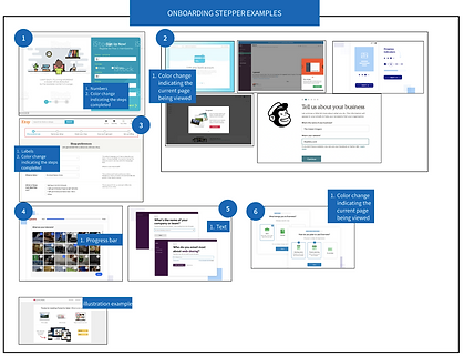
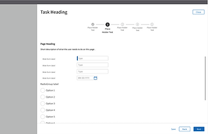
Onboarding Wizard
Stepper
It is visually heavy and designed to reduce the cognitive load and give a clear understanding of the current state of the user in a quick glance.
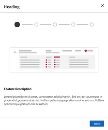
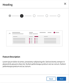
Illustration/Image container
Illustration/screenshot container is used to attract the attention of the user since the span of attention is very short and the human brain is known to better respond to and process visual data.

Action Buttons
The buttons at the footer are always active and appear based on the scenario - to reduce the cognitive load and clearly indicate the actions that are relevant for a particular scenario avoiding confusion.
Process Wizard
How it works?
-
It appears above a darkened overlay or scrim that blocks the content below. This reduces visual clutter and focuses user attention.
-
It addresses only simple flows that have steps ranging from 3 – 5.
-
Used to collect information for short forms (5 or fewer input fields). Page layout should be used if the input fields exceed the limit.
-
All the details entered can be accessed and edited by going back and forth between the steps.

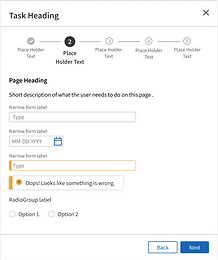


Error Scenario
The design uses helpful constraints to prevent the user from making any slips. It provides inline validation along with error message next to the input field thereby minimizing the load on working memory.
Warning
The existing modal component was used to draw the user's attention to a potential error. It explains the details of the error and helps the user to fix the issue.
How it works?
-
It addresses complex workflows that have steps ranging from 5 to 7.
-
It is used to collect information for complex forms that consist of more than 5 input fields.
-
All the details entered can be accessed and edited by going back and forth between the steps.
-
Error scenario – have the same behavior as that for the compact layout.

Action Buttons
The buttons on the footer are always displayed but are only activated based on the scenario. This gives a better idea of the actions that are available to the user. Also, it avoids any confusion and distraction that the user would face when the buttons appear and disappear continuously.

Warning
The existing modal component was used to draw the user's attention to a potential error. It explains the details of the error and helps the user to fix the issue.
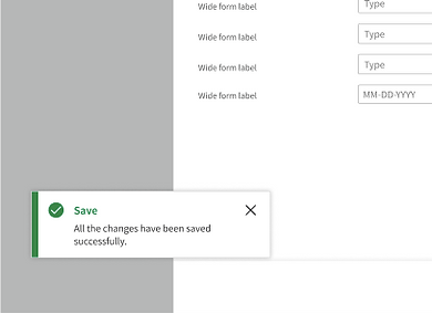
Success Message
The existing toast message component was used to display success messages. The information appears as a passive notification and does not require any user action - disappears in 7 secs.
Bulk Actions
How it works?
-
The existing combo button option is used to display the action buttons.
-
The action buttons are supposed to be placed on the top left corner of the tab. These buttons only appear after the user selects at least of the elements. This reduces clutter and prevents confusion among the users about what to select first – the element or the action button.
-
Checkboxes should be displayed by default and should have a clear indication for selection.
-
The number of elements selected should be displayed on the top right corner of the tab.
-
All the secondary actions should appear as a pop-up.
-
All the success messages appear on the bottom left corner of the screen.

Secondary Action
Dialogue box was used to address secondary actions. This avoided visual clutter and made the flow simpler enabling the users to perform the task effeciently.
Bulk Action Bar
The action bar appears only after the selection of at least one checkbox. This helps to reduce the visual noice and simplify the process.


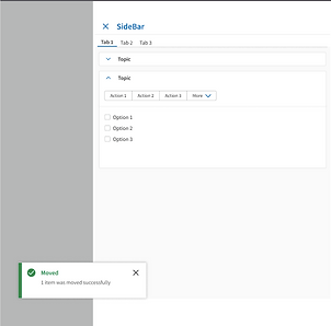
Selection
A clear indication of the number of items/checkboxes selected to avoid any decision uncertainity thereby reducing cognitive load.
Success Message
The existing toast message component was used to display success messages. The information appears as a passive notification and does not require any user action - disappears in 7 secs.
4. Prototype
Constraints, Learnings, & Next Steps
Constraints
-
Tight timeline of 10 weeks
-
Usage of only Forge design components to design new patterns
Learnings
-
UX design in Agile setup
-
Navigating ambiguity as a UX designer
-
Improvising as we learn
Next Steps
-
Conduct usability testing and create design iterations based on the feedback
-
Create design components for the Figma library and include those components as part of the forge design system
-
Prepare detailed guidance for the usage, various interactions, and behaviours of the pattern